Reed.co.uk - CV Search
Reimagining how recruiters search the reed’s database for talent
A little intro to reed.co.uk
Reed is a top recruitment brand in the UK connecting jobseekers directly with jobs via their own recruiters as well as the reed.co.uk website.
In addition to jobseekers applying for jobs, reed.co.uk allows them to store their CV on their profile. As a result, recruiters paying for access to the CV Search product, can dip into the database and search for candidates based on keywords they have on their CV and contact them directly.

Project goal
The CV Search product had been around for years but it hadn't been updated recently.
As a result, it looked outdated and had several usability issues. Over the years, the team had received a lot of feedback about the existing problems with the product, as well as requests for new features.
My goal was to analyse the recruiters’ feedback, look at competitors and work with the Product owner to reimagine the entire experience.
Part 1 - Understand
1. Feedback analysis and contextual interviews
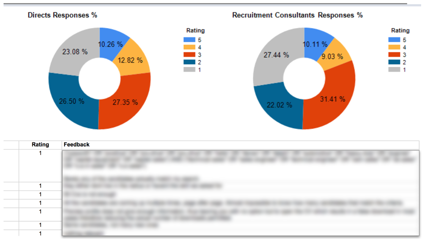
To understand the issues that users were facing with CV Search, I began by analyzing the feedback we had received through an online form on the existing CV Search pages. The form had two questions: the first asked users to rate their experience, and the second allowed them to provide free-text feedback.
In addition to analyzing the feedback we had gathered, I interviewed the internal recruitment team at reed.co.uk and observed them using the product in their natural environment. Even though they don't pay to access our site, the internal recruiters are end-users, and it was valuable to hear their insights on how they use our product.
I organized all the feedback I had received in a spreadsheet and created tags for each piece of feedback. The tags helped me to group the information, and I eventually created themes that contained multiple tags. This approach gave me a better understanding of the high-level issues that users were mostly complaining about.
Based on the frequency and severity of each theme, I prioritized the feedback and presented my findings to the Product Owner.
2. Competitor analysis
In addition, I performed a competitor analysis to evaluate the strengths and weaknesses of reed's CV Database product compared to its main competitors. To accomplish this, I worked with stakeholders to gain access to key competitor sites such as Jobsite, LinkedIn, Indeed, and more. Through this process, I identified the features that our competitors were offering and compared them to reed's strengths and weaknesses. This analysis also helped me better understand our users' feedback and references to other sites and products that I was not previously familiar with.
3. Card sorting
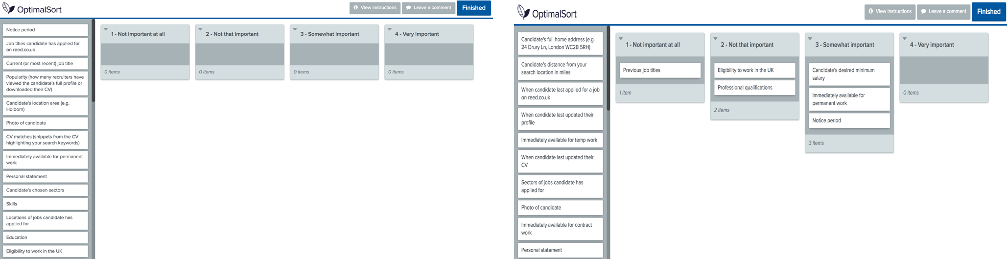
To better understand how our users prioritize the candidate information provided in CV Search, I created a card sorting exercise using a survey tool called Optimal Workshop. I sent the exercise to recruiters via email, with each card containing a different piece of candidate information. Recruiters were asked to prioritize the cards based on their importance to them.
Since different recruiter personas have different needs, which sometimes are conflicting, I made sure that all customer types were equally represented.
Using the responses received, I was able to prioritize the pieces of information presented to recruiters. The results showed that some pieces of information could eventually be omitted.
Part 2 - Design
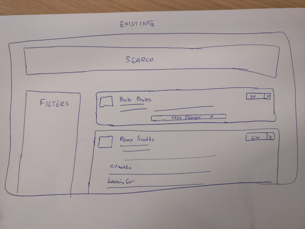
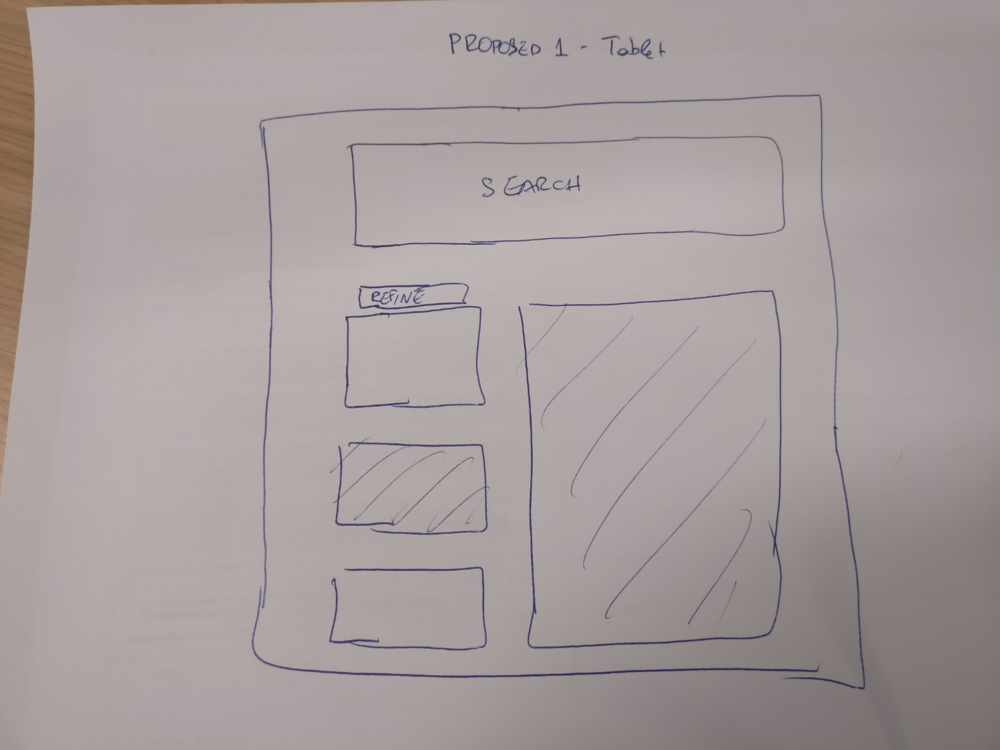
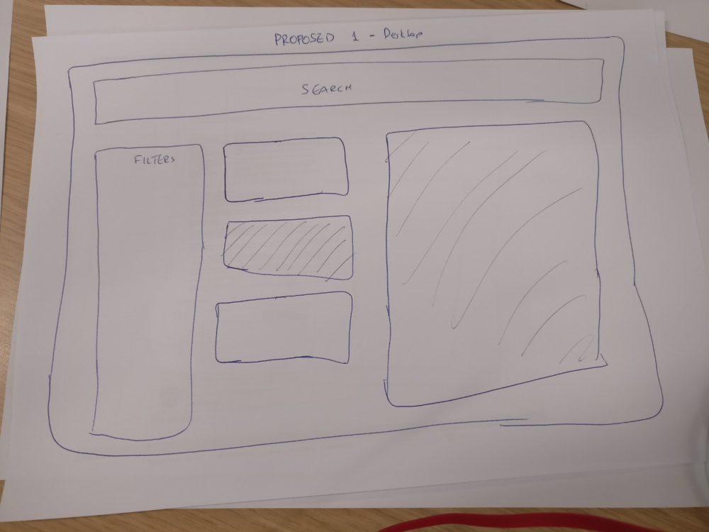
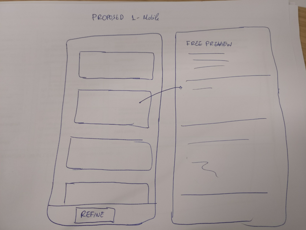
Sketching
Following the initial interviews, it became clear that many users were struggling with the layout of the CV Search results page. To address these issues, I experimented with various ways of presenting the information.
I shared my sketches with the rest of the design team and the product owner, and we agreed that the layout shown below was the most suitable solution.
2. Wireframes and interactive prototype
After finalizing the sketches, I created the first version of static wireframes. These were presented to the developers to ensure that the proposed design was feasible to build.
Using Axure, I turned the wireframes into an interactive prototype that was responsive and covered all three basic views (mobile, tablet, and desktop). To create the tablet and mobile prototypes, I utilized Invision.
Some of the improvements included
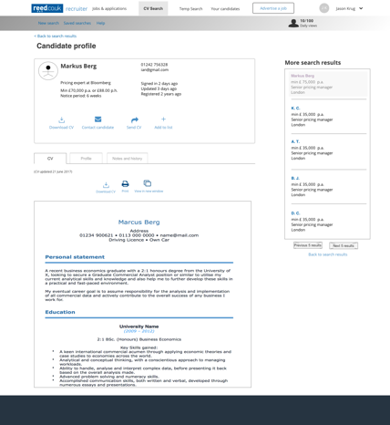
Search results easier to scan with new layout
Clear candidate activity labels
Longer, easier to read free candidate preview
Introduction of timestamps
Responsive pages
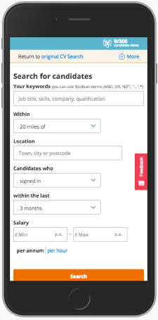
Mobile view wireframes
Desktop view wireframes


Some of the improvements included in the new designs:
Search results easier to scan with new layout
Clear candidate activity labels
Longer, easier to read free candidate preview
Introduction of timestamps
Responsive pages
Part 3 - User feedback
1. Internal testing using design prototype
To gather early feedback, I presented the designs to internal stakeholders such as internal recruiters, account managers, customer experience team members, and sales team members.
During the testing phase, I focused on elements such as navigation across different pages, the new information architecture, and information design. The testing was conducted across all three device types.
Based on the feedback received, I made several tweaks to the initial designs to improve their usability and effectiveness.
2. Usability testing with MVP & Beta launch
When the final designs were complete and the team had a minimum viable product (MVP), I conducted another round of testing with an external audience.
Additionally, we rolled out the new version to a small group of clients and requested feedback via a link on the site.
Overall, the majority of feedback we received was positive, but there were requests for missing features that we had not included in the first iteration. We analyzed this feedback to prioritize the backlog and develop a plan for the next iteration.

The team was able to roll out the Beta version of the product to 100 recruiters on schedule, and we received positive feedback on the improved usability and overall design.
The developers became more invested in the project and were eager to take notes during user testing sessions.